Learn how to create simple user profile viewer in javascript.
Many websites have about or team page where they show the list of peoples that are associated with the company in someway or other.
Sometimes they want to show then details of these people on certain user actions like you click or hover on the user profile card.
I have also created a similar user profile viewer in javascript, which shows the user name initially and once we have clicked on it, this show’s the details and social media handles of the user.

By building this project you will learn
- HTML:- How to create layout such that the design can be reversed.
- CSS:- Align items properly and create different transition effects.
- Javascript:- Toggle classes on click.
I guess you have good idea about what are we going to create, so lets start building it.
I have broken the development in three different parts.
- We will first create the layout.
- Then style the elements and create different transition effects.
- Add and remove class on click with javascript.
Creating the HTML layout.
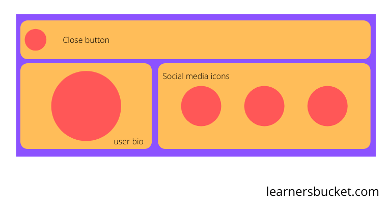
If you monitor the image closely you will realize that there are three different component in our layout.
- Close button.
- User-bio circle.
- Social media icons.
Close button and social media icons are simply icons inside an elements. I have used fontawesome for the icons.
But the user bio is little bit different because when we click on it, the circle expands and all its property changes. It also has user description inside.
To create this effect, I have used two different circles which transition in sync to create this flip and grow effect.
<!-- Wrapper -->
<div class="profile">
    <!-- Close Button  -->
    <div class="close-btn">
        <span><i class="fa fa-times" aria-hidden="true"></i> </span>
    </div>

    <!-- User bio details -->
    <div class="user-bio">
        <!-- User name -->
        <div class="circle front">
            Prashant Yadav
        </div>
        <!-- User description -->
        <div class="circle back">
            Software Developer with 3+ years of experience facilitating
            cutting-edge engineering solutions with a wide range of applications
            and technology skills
        </div>
    </div>

    <!-- User social media handles -->
    <div class="social-icons">
        <a class="icons" href="#" target="_blank">
            <i class="fa fa-twitter" aria-hidden="true"></i>
        </a>
        <a class="icons" href="#" target="_blank">
            <i class="fa fa-linkedin" aria-hidden="true"></i>
        </a>
        <a class="icons" href="#" target="_blank">
            <i class="fa fa-github" aria-hidden="true"></i>
        </a>
    </div>
</div>
Styling the layout and adding the transition effects.
This is how we can align our elements with CSS to create the design.
All the elements are placed inside a wrapper, so to align the items we will have to flex them.
* {
  box-sizing: border-box;
}

/* wrapper */
.profile {
  display: flex;
  align-items: center;
  flex-wrap: wrap;
  max-width: 80%;
  margin: 20px auto;
}
Close button
We just make this flex 100% and style the span inside it to become a circle and align it to left.
Initially it will be shrink to 0 and rotated 360 degree which will make it hidden and on transition it will scale to 1 and rotate to 0 creating a spinning effect.
/* Close button */
.close-btn {
  flex: 1 1 100%;
  display: inline-flex;
  align-items: center;
  flex-direction: inherit;
}

.close-btn > span {
  display: inline-flex;
  width: 50px;
  height: 50px;
  border-radius: 50%;
  background: red;
  justify-content: center;
  align-items: center;
  font-size: 1.8em;
  color: #fff;
  box-shadow: 0 0 8px #000;
  cursor: pointer;
  transform: scale(0) rotateZ(360deg);
  transition: transform 0.35s cubic-bezier(0.25, 0.46, 0.45, 0.94);
}

/* Transform on open */
.open .close-btn > span {
  transform: scale(1) rotateZ(0);
}
Designing the user-bio.
To design the user I have created two circles absolute positioned one over the other. To create the circles I have used a common class and then different classes to differentiate them.
/* User circle */
.user-bio {
  display: flex;
  justify-content: center;
  align-items: center;
  position: relative;
  width: 400px;
  height: 400px;
}

/* Circle */
.circle {
  display: flex;
  justify-content: center;
  align-items: center;
  text-align: center;
  position: absolute;
  top: 50%;
  left: 50%;
  border-radius: 50%;
  border: 1px solid;
  backface-visibility: hidden;
  transition: transform 0.4s cubic-bezier(0.25, 0.46, 0.45, 0.94),
    background 0.4s cubic-bezier(0.25, 0.46, 0.45, 0.94);
  box-shadow: 0 0 8px #000;
}
The backface-visibility decides whether the back of the element should be visible to the user or not. This hides the circles which are rotated and are not facing the users.
The first circle contains only the name of the user, on click of it it will flip backward, that is it will rotate 180deg.
.front {
  background: #3f51b5;
  width: 320px;
  height: 320px;
  margin: -160px;
  font-size: 2.5em;
  color: #fff;
  padding: 10px;
  cursor: pointer;
}

.front:hover {
  background: #232844;
}

/* When profile is open */
.open .front {
  transform: rotateY(180deg);
}
The second circle is bigger than the first circle, but it is initially rotated and shrink, As backface-visibility hides the elements which are not facing the user. It remains hidden behind the first circle.
When we transition on click, the first circle rotates back and the second circle rotates front making it visible and hiding the later.
This creates the flipping effect that circle rotates and gets bigger.
.back {
  width: 400px;
  height: 400px;
  background: #ff5722;
  margin: -200px;
  font-size: 1.4em;
  color: #000;
  padding: 20px;
  /* Shrink and rotate initially */
  transform: scale(0.7972973) rotateY(180deg);
}

/* Scale it to normal */
.open .back {
  transform: scale(1) rotateY(0);
}
Styling the social media icons
This icons will be a circle which will distributed evenly in their space using flexbox and hidden just like the close button by shrinking and rotated 360 deg.
On transition they will scale to 1 and rotate 0.
/* Icons */
.social-icons {
  display: inline-flex;
  justify-content: space-evenly;
  align-items: center;
  flex: 1;
}

.icons {
  display: inline-flex;
  width: 120px;
  height: 120px;
  border-radius: 50%;
  background: #8e24aa;
  justify-content: center;
  align-items: center;
  font-size: 3em;
  color: #fff;
  text-decoration: none;
  transform: scale(0) rotateZ(180deg);
  transition: transform 0.28s cubic-bezier(0.25, 0.46, 0.45, 0.94);
  box-shadow: 0 0 8px #000;
}

.icons:nth-child(1) {
  transition-delay: 0.12s;
}

.icons:nth-child(2) {
  transition-delay: 0.24s;
}

.icons:nth-child(3) {
  transition-delay: 0.36s;
}

/* Transfrom and show icons */
.open .icons {
  transform: scale(1) rotateZ(0);
}
Each icon have a transition delay which make them appear one after another.
You can also change the order by simply adding a single class and updating a single property. This is the beauty of flexbox for aligning the items because we can change the order with single property.
/* Reverse the direction on right placement */
.profile.right {
  flex-direction: row-reverse;
}
This will reverse the whole alignment moving the things to right.

Toggling the class on click with javascript
When user clicks on the user circle it should add the class to the parent which will perform all the transitions.
const Front = document.querySelector(".front");
const Close = document.querySelector(".close-btn > span");
const Profile = document.querySelector(".profile");

//Add open class
Front.addEventListener("click", () => {
  profile.classList.add("open");
});

//Remove the class
Close.addEventListener("click", () => {
  profile.classList.remove("open");
});
I hope you have learned something today 🙏🏻🙏🏻.