Previously we had seen how to create single checkbox in react. Let us know see how can we create a checkbox group component in react.
Checkboxes can be a single or multiple elements and either some or all the elements can be checked at any time.
We will reuse our existing checkbox component and generate the group by taking an array of options.
Following is the list of props we are expecting in our component.
options: PropTypes.arrayOf(
    PropTypes.shape({
    value: PropTypes.any.isRequired,
    label: PropTypes.string.isRequired,
    disabled: PropTypes.bool
    })
).isRequired,

name: PropTypes.string.isRequired,

onChange: PropTypes.func,

/* All radio items will be inline-flexed if this is true */
inline: PropTypes.bool,

/* Applied to container of all radio items */
className: PropTypes.string,

/* Applies to each item in this group */
itemClassName: PropTypes.string,

/* Applies to the label of each item in this group */
labelClassName: PropTypes.string,

/* Applied to actual input */
inputClassName: PropTypes.string,

value: PropTypes.oneOfType([PropTypes.array, PropTypes.string]),

/* Applies to custom label for checkbox */
customLabelClassName: PropTypes.string,

checkedItemLabelClassName: PropTypes.string,

/* To be used for resetting state */
reset: PropTypes.bool,

/* To be used for clearing state*/
clear: PropTypes.bool,

/* ref of the component */
ref: PropTypes.instanceOf(Element)
These are some of the essential props we need. We can use the *ClassName to override the style of any component. You can also add extra props as per your requirement.
In options we are are expecting an array of objects of the defined shape and using this we will generate our group of checkbox components.
value can be single string or an array of string as there can be multiple checked values.
Now as we got the understanding of list of props. Let us start creating our component.
We will be using few extra packages to simplify the development.
prop-types: To make sure we receive proper props.classnames: Using this we can use CSS classes as javascript objects, we just need to name our css file asfilename.module.cssto make this work.lodash: This contains list of helpful function which we will be using for various purpose like check the data types of value etc.
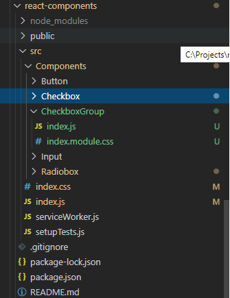
Following is the folder structure of our checkbox group component.
First, import all the required packages at the top.
As we need to maintain the state of the component we will be creating a class component.
import React, { Component } from "react";
import PropTypes from "prop-types";
import cx from "classnames";
import styles from "./index.module.css";
import Checkbox from "../Checkbox";
import { isString, indexOf, isEqual } from "lodash";

class CheckboxGroup extends Component {
 //other code will go here
}

export default CheckboxGroup;
Now validate the props at the beginning to make sure we don’t miss anything while creating the component.
static propTypes = {
    options: PropTypes.arrayOf(
        PropTypes.shape({
        value: PropTypes.any.isRequired,
        label: PropTypes.string.isRequired,
        disabled: PropTypes.bool
        })
    ).isRequired,

    name: PropTypes.string.isRequired,

    onChange: PropTypes.func,

    /* All radio items will be inline-flexed if this is true */
    inline: PropTypes.bool,

    /* Applied to container of all radio items */
    className: PropTypes.string,

    /* Applies to each item in this group */
    itemClassName: PropTypes.string,

    /* Applies to the label of each item in this group */
    labelClassName: PropTypes.string,

    /* Applied to actual input */
    inputClassName: PropTypes.string,

    value: PropTypes.oneOfType([PropTypes.array, PropTypes.string]),

    /* Applies to custom label for checkbox */
    customLabelClassName: PropTypes.string,

    checkedItemLabelClassName: PropTypes.string,

    /* To be used for resetting state */
    reset: PropTypes.bool,

    /* To be used for clearing state*/
    clear: PropTypes.bool,

    /* ref of the component */
    ref: PropTypes.instanceOf(Element)
};

static defaultProps = {
    itemClassName: "",
    className: "",
    labelClassName: "",
    inputClassName: "",
    customLabel: ""
};
In these static methods we can validate the props and also set the defaults if we don’t receive the requested.
Create state to store and monitor the changes in the component. You can directly declare state but I like to use the tradition old method of declaring it inside the constructor.
constructor(props) {
  super(props);

  const { value, reset, clear } = props;
  let values = value || [];

  //If value is single string
  //Convert it to array
  if (isString(values)) values = [values];

  this.state = { values };

  //If reset is requested
  reset && this.resetValue();

  //If clear is requested
  clear && this.clearValue();
}
If checked checkboxes value is already provided then assign it to the state.
As the checked checkboxes value can be single string or an array of it. We need to check it and set it accordingly.
_.isString(value) is a function from lodash package which checks if the value is of string type or not.
Also if it is initially requested to reset or clear the checkboxes then do it.
Create the function to reset and clear the component.
  //Reset to initial state
  resetValue = () => {
    const { name, onChange, value } = this.props;
    let values = value || [];

    //If value is single string
    //Convert it to array
    if (isString(values)) values = [values];

    this.setState({ values });
    onChange && onChange({ name, value: values, isResetted: true });
  };

  //Uncheck all checkboxes
  clearValue = () => {
    const { name, onChange } = this.props;
    this.setState({ values: [] });
    onChange && onChange({ name, value: [], isCleared: true });
  };
Now separate the classes for each component of the checkbox and render it.
render() {
    const {
      itemClassName,
      className,
      labelClassName,
      name,
      inline,
      options,
      inputClassName,
      customLabelClassName,
      checkedItemLabelClassName
    } = this.props;

    const _itemClassName = cx(itemClassName, {
      [styles.inlineItem]: inline
    });

    const _className = cx(styles.item, className);

    const { values } = this.state;

    return (
      <div className={_className} ref={this.props.ref}>
        {/* Generate checkboxes from the array of options */}
        {options.map((option, index) => (
          <Checkbox
            booleanOutput={false}
            option={option}
            key={index}
            value={indexOf(values, option.value) !== -1}
            onChange={this.handleChange}
            name={name}
            className={_itemClassName}
            inputClassName={inputClassName}
            labelClassName={labelClassName}
            checkedItemLabelClassName={checkedItemLabelClassName}
            customLabelClassName={customLabelClassName}
          />
        ))}

      </div>
    );
  }
We are checking if the current option’s value is in the checked list or not with _.indexOf(values, option.value) !== -1.
Now let’s listen to the change event.
  //Change event listener
  handleChange = ({ name, value, checked }) => {
    const { onChange } = this.props;
    let values = [...this.state.values];

    //If checked then add the value in the checkedlist
    if (checked) {
      values.push(value);
    } else {
      //Else remove from the checked list
      const existingIndex = indexOf(values, value);
      if (existingIndex !== -1) {
        values.splice(existingIndex, 1);
      }
    }

    //Set the inner state
    this.setState({ values });

    //Send the changes to parent
    onChange && onChange({ name, value: values });
  };
In this change event listener we are checking if the checkbox is already checked then remove it’s value from the checked list else add to it and notify the changes to the parent.
If the component is a controlled component then we will be receiving the updated props from the parent. That is why we need to check previous and the current props and update the state only when props are different because we already maintaining the state.
 componentDidUpdate(previousProps) {
    const { value, reset, clear } = this.props;

    //If value is different then only update the state
    if (!isEqual(previousProps.value, value)) {
      let values = value || [];

      //If value is single string
      //Convert it to array
      if (isString(values)) values = [values];
      this.setState({ values });
    }

    //If reset is requested
    reset && this.resetValue();

    //If clear is requested
    clear && this.clearValue();
  }
Complete code of checkbox group component in react.
import React, { Component } from "react";
import PropTypes from "prop-types";
import cx from "classnames";
import styles from "./index.module.css";
import Checkbox from "../Checkbox";
import { isString, indexOf, isEqual } from "lodash";
class CheckboxGroup extends Component {
static propTypes = {
options: PropTypes.arrayOf(
PropTypes.shape({
value: PropTypes.any.isRequired,
label: PropTypes.string.isRequired,
disabled: PropTypes.bool
})
).isRequired,
name: PropTypes.string.isRequired,
onChange: PropTypes.func,
/* All radio items will be inline-flexed if this is true */
inline: PropTypes.bool,
/* Applied to container of all radio items */
className: PropTypes.string,
/* Applies to each item in this group */
itemClassName: PropTypes.string,
/* Applies to the label of each item in this group */
labelClassName: PropTypes.string,
/* Applied to actual input */
inputClassName: PropTypes.string,
value: PropTypes.oneOfType([PropTypes.array, PropTypes.string]),
/* Applies to custom label for checkbox */
customLabelClassName: PropTypes.string,
checkedItemLabelClassName: PropTypes.string,
/* To be used for resetting state */
reset: PropTypes.bool,
/* To be used for clearing state*/
clear: PropTypes.bool,
/* ref of the component */
ref: PropTypes.instanceOf(Element)
};
static defaultProps = {
itemClassName: "",
className: "",
labelClassName: "",
inputClassName: "",
customLabel: ""
};
constructor(props) {
super(props);
const { value, reset, clear } = props;
let values = value || [];
//If value is single string
//Convert it to array
if (isString(values)) values = [values];
this.state = { values };
//If reset is requested
reset && this.resetValue();
//If clear is requested
clear && this.clearValue();
}
componentDidUpdate(previousProps) {
const { value, reset, clear } = this.props;
//If value is different then only update the state
if (!isEqual(previousProps.value, value)) {
let values = value || [];
//If value is single string
//Convert it to array
if (isString(values)) values = [values];
this.setState({ values });
}
//If reset is requested
reset && this.resetValue();
//If clear is requested
clear && this.clearValue();
}
//Reset all the selected checkboxes
resetValue = () => {
const { name, onChange, value } = this.props;
let values = value || [];
//If value is single string
//Convert it to array
if (isString(values)) values = [values];
this.setState({ values });
onChange && onChange({ name, value: values, isResetted: true });
};
//Uncheck all checkboxes
clearValue = () => {
const { name, onChange } = this.props;
this.setState({ values: [] });
onChange && onChange({ name, value: [], isCleared: true });
};
//Change event listener
handleChange = ({ name, value, checked }) => {
const { onChange } = this.props;
let values = [...this.state.values];
//If checked then add the value in the checkedlist
if (checked) {
values.push(value);
} else {
//Else remove from the checked list
const existingIndex = indexOf(values, value);
if (existingIndex !== -1) {
values.splice(existingIndex, 1);
}
}
//Set the inner state
this.setState({ values });
//Send the changes to parent
onChange && onChange({ name, value: values });
};
render() {
const {
itemClassName,
className,
labelClassName,
name,
inline,
options,
inputClassName,
customLabelClassName,
checkedItemLabelClassName
} = this.props;
const _itemClassName = cx(itemClassName, {
[styles.inlineItem]: inline
});
const _className = cx(styles.item, className);
const { values } = this.state;
return (
{/* Generate checkboxes from the array of options */}
{options.map((option, index) => (
As your checkbox component is already styled we don’t need to style this parent component. We will just passing few css properties to change the alignment as per our need.
Complete style code of checkbox group.
//index.module.css
.item {
  display: flex;
}

.inlineItem {
  display: inline-flex;
}
Input
ReactDOM.render(
  <div className="abc">
    <CheckboxGroup
      options={[
        { label: "I am not checked", value: "xyz", disabled: false },
        { label: "I am checked", value: "abc", disabled: false },
        { label: "I am disabled", value: "pqr", disabled: true },
        { label: "I am checked as well", value: "lmn", disabled: false }
      ]}
      name="radio"
      value={["abc", "lmn"]}
      inline={true}
    />
  </div>,
  document.getElementById("root")
);
Output
